Design Series – Article 3
One of the biggest considerations when presenting a concept, whether budget numbers or design, is to understand our target audience. This impacts the type of information we are presenting and how we communicate it. Going one step further, clearly identifying our goals of the presentation allows us to be more concise in the conveyance of our information.
Easier said than done.
Design can be personal. Therefore, when one presents an idea to an audience with no preconceived idea or knowledge of the design, the tendency is to explain every nuance of the design to justify every move and the weight of thought and purpose it carries. While this is acceptable, normal, and even expected in academia, this might not be considered efficient or essential in a professional setting.

In a typical meeting, the goal is to convey ideas as efficiently as possible to respect the participant’s time. While not all meetings are necessarily “big idea” or planning meetings, even the coordination meetings with concentration on details demand an efficiency and respect of time. It is important to understand the audience and context of the meeting to determine the type of information to be presented within a specified time.
For example, when presenting design concepts in a community meeting, it could be potentially counterproductive to highlight every aspect of the design due to the volume of information being given to an audience with limited understanding of the technical content in a compressed amount of time. There is potential to deviate from the key issues that are critical for understanding. Instead, a more effective manner of communication could be to simplify technical information to diagrams, highlight key architectural features and avoid using big architecture laden words that are hard to understand.

This example illustrates how architects and designers should also visually communicate design concepts in a clear and effective manner. Instead of highlighting building organizational diagrams and floor plans with colors based on use of spaces, the types of spaces can be highlighted so there are visually less colors and more groupings of colors. Text sizes and arrows should be big, bold, and selectively located with consideration to type, size, and media of presentation. Large paragraphs of text should be avoided or generously spaced and organized with breaks of images for visual relief. This way, the information is easy to understand by all parties and the material substance is enhanced due to the organization and clarity of the presentation.
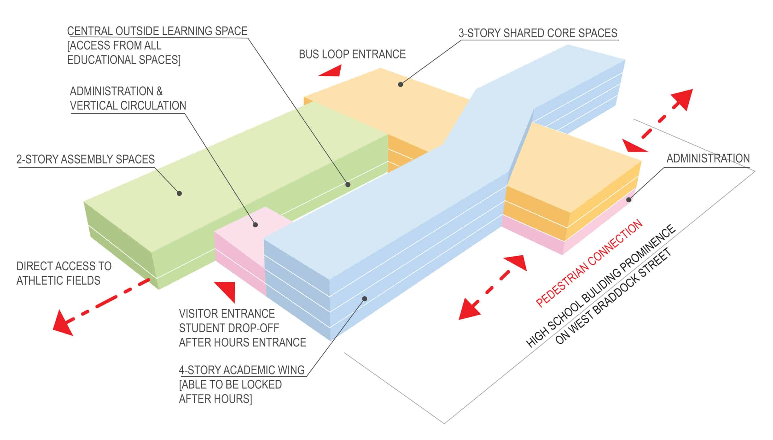
A valuable lesson while preparing for a presentation is to understand the time value spent on producing content and presentation impact. A building organization diagram that conveys the same intent as a floor plan is redundant and can be eliminated or simplified to emphasize broader building concepts. Having more images is not necessarily better, and every image does not need to have equal emphasis. Renderings with significant design detail in early stages of development can detract from the stakeholder’s understanding of basic spatial relationships, potentially forcing them to focus on intimate details that have not been flushed out with the design team.
Sometimes less is more.